Atmosphere
The Photograph Cropped Out the Problem
Inspiration images are useful only after you identify what the camera excluded. Learn to borrow the transferable design logic without copying a frame that never had to host real guests.
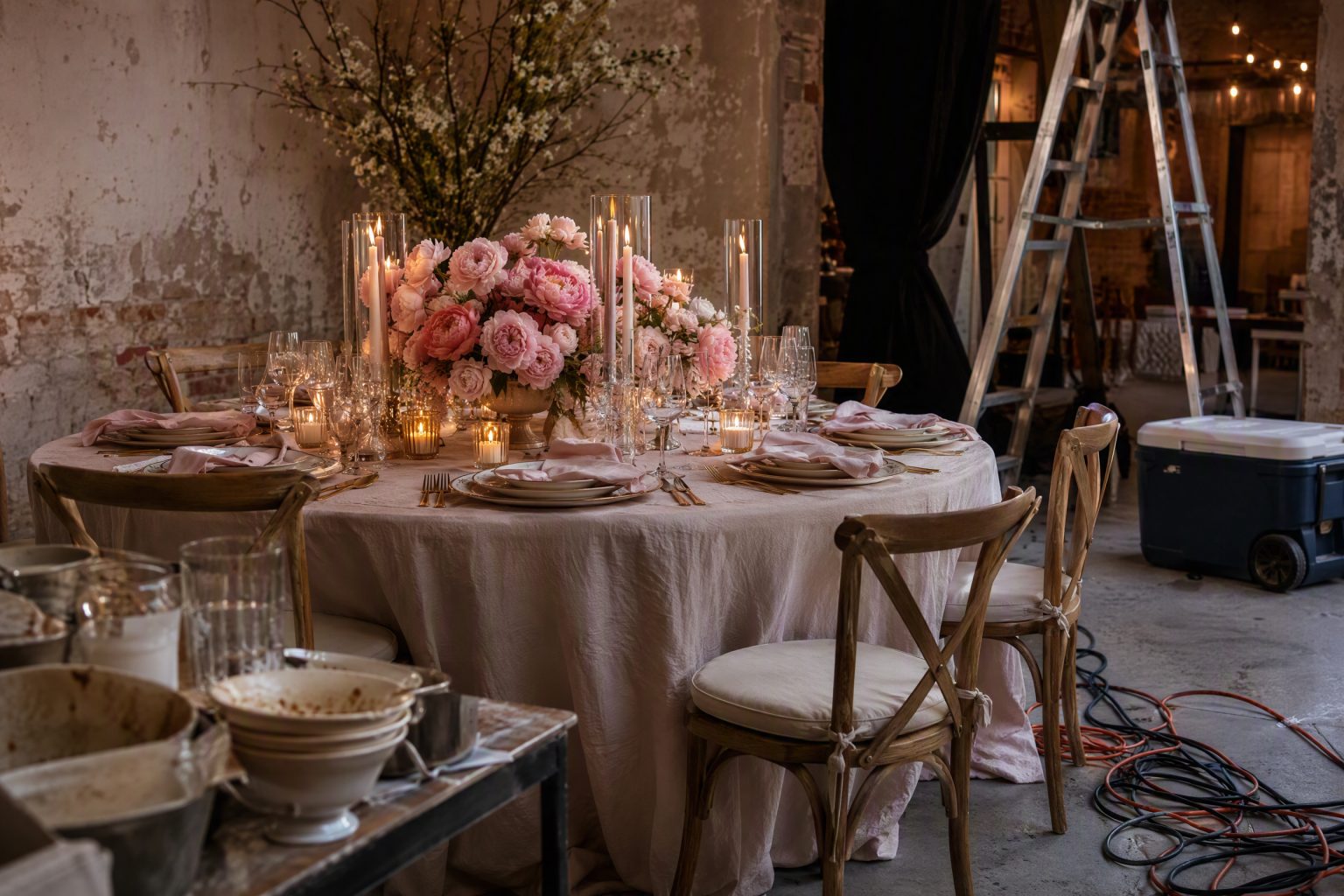
Event inspiration photographs are not lying to you.
They are simply very selective witnesses.
The camera sees the floral wall. It does not see the service door six feet to the left. It sees twelve perfect chairs. It does not show the sixty more chairs required for the room. It sees candlelight at one table, not the emergency exit sign above the next one.
That does not make the image useless.
It makes the crop part of the evidence.
First ask what the photograph is actually proving
A beautiful image may prove that a color combination works under that light. It may show a convincing floral proportion, a strong material pairing, an interesting table edge, or a useful way to repeat shape.
It does not automatically prove that the full event worked.
Separate the visible design lesson from the invisible event claim.
If you love the image because of the dark green linen, brass light and low white flowers, take those relationships. You do not need to inherit the entire setup, guest count, venue or budget to use the idea.
Find the missing ceiling, doorway and floor
The quickest way to read an inspiration image is to notice what has been cropped away.
No ceiling? The installation may depend on a ceiling height or rigging condition you cannot see. No floor? The table may be standing on a surface that changes the whole palette. No doorway? You do not know how the room is entered or serviced. Tight crop on one table? You do not know whether the design repeats beautifully at scale or becomes exhausting across forty tables.
None of those are accusations, just unanswered questions.
Do not ask a photograph to know what it was never meant to show.
Count the bodies the image removed
Styled event photography often captures rooms before guests arrive or during a brief clean interval.
That is exactly when furniture spacing looks most generous, tabletop looks most pristine and circulation is easiest to photograph.
Add people back mentally.
Pull the chairs out. Put jackets on chair backs. Add handbags. Add glasses in use, bread plates, phones, a server trying to reach the center, a guest standing to greet someone behind them.
If the design only works while everyone is absent, it is a set.
A useful inspiration image should survive the imaginary arrival of the guest.
The camera likes density in ways the room may not
Dense flowers, layers of glassware, candles, stationery and objects can look extraordinary in a frame because the image compresses them into one controlled composition.
At the table, density has physical consequences.
Where does the water bottle go? Can the guest see across the table? Can a platter land? Can a server clear without lifting a sleeve through foliage? Does the candle sit where someone will reach over it?
I like abundance. I just want it to leave enough room for the event.
Copy the hierarchy, not the inventory
One of the best ways to use visual references is to identify the hierarchy.
What is carrying the image?
Maybe the ceiling treatment is the hero and the table is deliberately quiet. Maybe one monumental arrangement gives the room scale while everything around it is restrained. Maybe the entire image depends on repetition of a single color. Maybe the drama comes from contrast between rough architecture and very refined tabletop.
Once you know that, you can reproduce the logic at another budget and scale.
If the hero is overhead light, you may not need the same flowers. If the hero is one saturated linen color, you do not need twelve accessory categories. If the hero is abundance at the entrance, the rest of the room can breathe.
Protect the strongest decision.
Check whether the venue is doing half the work
Skip this and inspiration boards get expensive fast.
A stone courtyard, greenhouse, historic ballroom, white loft or old timber hall contributes architecture, texture, light and scale before a single rental arrives.
If your venue is visually quieter, copying only the decor from the photograph may not recreate the atmosphere because the venue was part of the composition.
Identify what the architecture supplied: height, patina, windows, landscape, color, ornament, darkness, symmetry.
Then decide whether your event needs to supply that missing layer through light, drape, planting, fabrication or simply a different concept better suited to the room you actually have.
The venue does not have to resemble the reference. It does need to be counted.
Look for the ugly necessity
Every real event has things the mood board would prefer not to discuss.
Speakers, power, trash, service stations, fire equipment, restrooms, coat storage, exit routes, bar backs, vendor cases, signage, accessible routes. Nobody pins those.
A strong design does not erase those things from reality. It integrates, screens, relocates or visually absorbs what can be managed while leaving required access intact.
When you study an image, ask where the ugly necessity probably went.
If there is no plausible answer, do not copy the composition without making one.
Build a three-line extraction
For every reference image you save, write three things.
What I want: the actual visual or emotional effect.
What may be doing the work: venue, light, scale, material, density, camera angle.
What I need to verify: sightlines, footprint, installation, guest use, weather, service or cost.
That little exercise turns a pretty picture into something you can actually build from.
Keep the beautiful image. I am not suggesting we all become emotionally attached to spreadsheets instead.
Just remember that the photograph is one frame of an event with a whole life outside it.
Borrow what survives the crop.
Related reading: Staff as Atmosphere · Lighting That Still Works After the Room Fills · The Venue Coordinator Is Not the Event Planner
Atmosphere OS · Theme Atelier
Where the feeling stops being a photograph.
Theme Atelier converts a direction into a documented design system with the lighting and material consequences attached. It runs in your browser and stays there until you decide the project is worth saving.
Costs come back as indicative bands rather than quotes, and seasonal notes are filters rather than promises.
Field notes and corrections
When a number here turns out to be wrong, you hear about it.
Three things arrive and nothing else. The new field note — bar rates, cover widths, service clearances, the arithmetic worked through on one real evening. A line when a new World or Mini Occasion opens, because a night only goes up once it can actually be thrown. And a correction whenever a rule in the published rulebook changes, or a number the tools rely on turns out to have been wrong. There is no weekly slot, because there is nothing weekly to put in it.
One email per field note or opening, plus corrections when a published figure moves. Unsubscribe from any of them.
Continue through the system
Pretty is still not a plan.
A party gets planned in roughly this order. Pick the chapter where your next problem lives.
What you have to decide next
One decision constrains the next. This is the order they actually happen in.
- Venue Will this room hold it? The Serpentine Table Is Eleven Percent Longer Than the Spec Sheet Says
- Guest experience How will guests move through it? The Place Setting Fits. The Person Does Not.
- Production How does it get built and run? The Event Needs a Failure Mode That Still Looks Intentional
- Vendors Who owns each handoff?
More in this chapter

See the complete five-chapter Event Design Intelligence map →