Guest Experience
The Event Should Explain Itself Without a Host Intervening
If the host answers the same five questions all night, the guests are not the problem. The room is withholding information.
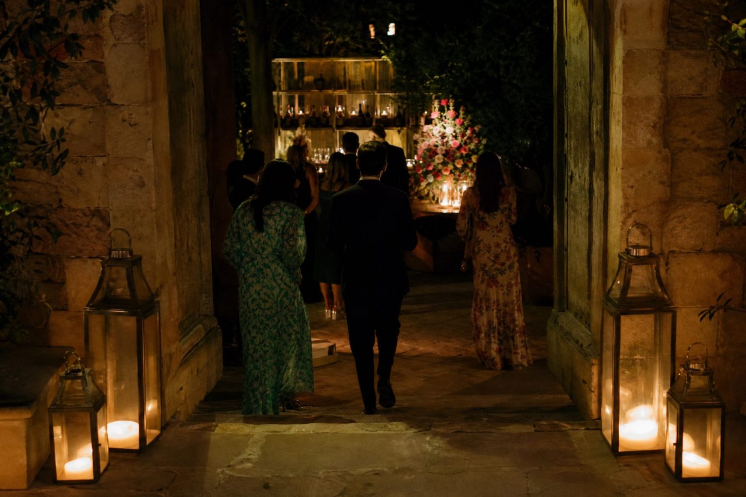
Where do we go?
Is this the right door?
Are we allowed to sit here?
Where is the restroom, and has dinner started?
If somebody is answering those five questions all evening — usually the host, usually while holding a drink they will never finish — the guests are not the problem. The room is withholding information.
Good wayfinding is not a venue covered in arrows. It is architecture, light, furniture, staff position and a small number of signs all agreeing about what a guest should do next.
The first wrong turn happens in the parking lot
Walk from where a guest genuinely arrives: parking, rideshare drop, shuttle stop, elevator, sidewalk, garden gate. The first moment of uncertainty almost always occurs before the decorated entrance is even visible.
- Can the right entrance be found without circling the property twice?
- Does the route work after dark and in the weather you are likely to get?
- Does the accessible route lead to the same arrival, not a service-side version of it?
- Are vendor loading and guest arrival separated where that is possible?
- Is there somewhere comfortable to stand if doors or transport run late?
No sign in the ballroom has ever fixed a confusing driveway. The plan has to start where the car stops, not where the party starts.
Let the building do the talking first
Open doors, clear sightlines, lighting, rugs, the way furniture faces, the sound of a room already in use — all of it moves people more naturally than text does. If the next space is the brightest, most open, most obviously alive place available, most guests will simply go there.
When the architecture is pointing the wrong way, argue back on purpose. Close or visually quiet the unused doors where the venue allows it. Light the correct path. Move the lounge that is accidentally standing in the route. Put a person where a person is more useful than another card on a stand.
Signs are for the things a room cannot say
They earn their place when several options look equally plausible, when the information has to arrive before the destination is visible, or when something simply needs a name: restrooms, parking, shuttle pickup, coat check, table assignments, accessibility information, the room nobody would guess was there.
Short wording. Readable. Placed where the decision actually gets made. A beautiful sign positioned after the turn is decorative evidence that the answer arrived late.
Then check type size, contrast, light, viewing distance, and whether an arrangement or a cluster of guests will be standing in front of it by eight o’clock.
A styled lounge nobody dares sit in is furniture, not hospitality
Guests hesitate in front of a perfectly composed lounge, bar or terrace when it reads more like a photograph than a working part of the party. And they are right to hesitate. It looks finished.
A chair turned slightly toward a conversation. A staffed bar. Visible water. A couple of coat hooks already in use. Small signals that the space is open for business, none of which require a word of text.
Nobody should feel that they are disturbing the design by using it.
Some questions need a human
Where a late guest should join. How a seating change is being handled. Where an accommodation has been arranged. Whether a room is open yet. These are social questions, and a card on an easel is bad at social questions.
Put staff where confusion is likely rather than where they look symmetrical on the floor plan, and brief them on the current version of the evening. A confident wrong answer does more damage than a missing sign, particularly after weather, timing or room assignments have moved.
Décor drifts into the route while nobody is watching
A route that was generous on the venue plan gets narrower with every urn, rug, cord, cocktail table, gift display, sign, camera case and queue that arrives. Check the installed event, not the drawing. Circulation is what the furniture leaves behind, not what the plan promised.
Confirm formal accessibility requirements and specific accommodations with the venue and appropriately qualified or official sources. On the design side, keep the accessible route visually part of the event, and make sure anyone using it receives the same orientation cues and the same access to the moments that matter.
Prepare the transition before you announce it
If guests need a lengthy explanation to get from cocktails to dinner, the room is not ready for them to move.
Before the cue: open the right doors, finish the destination, shift the lighting, position staff, clear the conflicting route, make the next space visibly available. Then a short invitation simply confirms what the room has already started saying.
The announcement should never be the only evidence that the evening has changed chapters.
Somebody is going to arrive late
They always do, and late arrivals expose weak wayfinding instantly: the greeter has moved on, the cocktail room is closed, and the signage is still confidently describing a phase of the evening that ended forty minutes ago.
Decide where a late guest enters, who notices them, and how they reach the live event without walking through backstage or a half-cleared room. Give them a shorter way into the current chapter. Nobody should have to re-enact the opening sequence just because they hit traffic.
An outdated sign is worse than no sign
Rain, heat, wind or any other disruption moves entrances, coats, ceremony locations, restrooms, bars and transportation. When the plan changes, the cues have to change with it.
A sign pointing hopefully toward a closed garden causes more trouble than an empty wall, because it looks authoritative. Give the alternate plan its own entrance logic, lighting, staff positions and route checks, and retire or cover the old directions the moment the call is made.
Check the late-night routes, not the pretty ones
Wayfinding has to survive darkness, moved furniture, a mountain of coats, service doors propped open, and the first stirrings of teardown. Guests still need restrooms, transportation, exits and their own belongings long after the decorative peak has passed.
Do not let useful light disappear because the photographer has gone home, and do not let strike equipment take over a route people are still walking.
The no-host test
Walk the whole event pretending the host is unreachable. Start outside. Arrive late. Find the restroom. Find the next room. Find your table. Put down an empty glass. Get your coat. Get to a car.
- Where did the architecture answer correctly on its own?
- Where did you actually need a sign?
- Where did you need a person?
- Where did two cues contradict each other?
- Where did décor make something less obvious than it was before?
Fix the contradiction before you add more explanation. More explanation is almost never the fix.
The room should do the explaining
The best wayfinding vanishes into the atmosphere. People go through the right door because it looks like the right door. They use the lounge because it behaves like a lounge. Help is standing where uncertainty was always going to be. Words appear only where words were genuinely required.
Design the event so the host gets to host. The room can carry the rest.
Atmosphere OS · Arc Studio
Write the order of the night before you book the band.
Arc Studio turns an intended feeling into a sequence with times against it and a production brief a crew can read on the day. Costs come back as bands and seasonal notes as filters, never as guarantees.
Free to use, local-first in your browser, and there is no account until you ask for one.
Field notes and corrections
When a number here turns out to be wrong, you hear about it.
Three things arrive and nothing else. The new field note — bar rates, cover widths, service clearances, the arithmetic worked through on one real evening. A line when a new World or Mini Occasion opens, because a night only goes up once it can actually be thrown. And a correction whenever a rule in the published rulebook changes, or a number the tools rely on turns out to have been wrong. There is no weekly slot, because there is nothing weekly to put in it.
One email per field note or opening, plus corrections when a published figure moves. Unsubscribe from any of them.
Continue through the system
Pretty is still not a plan.
A party gets planned in roughly this order. Pick the chapter where your next problem lives.
What you have to decide next
One decision constrains the next. This is the order they actually happen in.
More in this chapter
See the complete five-chapter Event Design Intelligence map →