Budget & Trade-Offs
How to Make an Expensive Event Look Effortless Instead of Overworked
Money is visible when it's trying too hard. Every surface covered, every purchase announced, and the first thought in the room is how hard someone worked.

Money is visible when it is trying too hard.
You can spend a great deal and still end up with an event that feels like it is performing its own budget. Every surface covered. Every possible detail displayed. Every purchase announced by its presence. Guests walk in and the first thought is not “this feels special.” It is “someone worked very hard and wants us to know it.”
The opposite is rarer and far more powerful: a room that feels calm, inevitable, and slightly understated even though the numbers behind it are not small. Getting there has very little to do with spending less and a great deal to do with deciding what gets to be loud.
Choose one thing to be the loudest
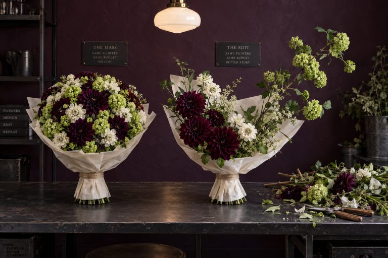
The expensive events that feel calm have a clear visual hierarchy. One element is allowed to be generous — the flowers, the lighting, the tableware, the architecture itself. Everything else supports it instead of competing.
When five different expensive things all try to be the star, the room becomes noisy. When one thing is given room to breathe and the rest are quieter, the whole composition feels intentional rather than accumulated.
Decide the primary gesture early and protect its budget and its space. Secondary elements should be designed to recede, not to match intensity.
Repeat materials instead of collecting them
A single beautiful material used in three or four places reads as coherent. Ten different beautiful materials used once each reads as a shopping list.
Pick the finishes that matter most and let them appear again — the same wood, the same metal, the same textile family, the same stone. The repetition creates a sense of calm that no amount of variety can match. Variety without repetition often feels restless.
I would spend decision time here before spending another dollar anywhere else. Coherence looks more expensive than a pile of different beautiful things.
Hide the operations
The more money that is spent, the more infrastructure is required: power, staging, staff circulation, storage, trash, backup equipment. If any of that is visible, the effort becomes the story.
Design the guest path so the working parts stay out of sight: service corridors, hidden storage, discreet power, staff who move quietly. Guests should feel the result, not the machinery that produced it.
Coherence looks more expensive than a pile of different beautiful things.
Visible operations turn even high-quality design into a production. Invisible operations let the design feel inevitable.
Protect negative space
Empty space can be the most expensive-looking decision in the room, because it takes nerve to stop adding.
Leave some surfaces clear. Leave some walls quiet. Leave some moments without a focal point. The things that remain then carry more weight. Overfilled rooms feel anxious no matter how beautiful the individual pieces are.
Negative space is also where people stand, talk, and finally put down a glass. It is doing a job, not waiting for one.
Edit for guest comfort before visual density
Temperature, seating depth, walking routes, noise level, and the ability to put a glass down without hunting are not decorative. They are the difference between an event that feels generous and one that feels like a set.
Spend first on the things that make people physically at ease. The visual luxury lands harder when the body is not working against the space. A beautiful room that is slightly too cold, too loud, or too tight will be remembered for the discomfort, not the finishes.
Know when to stop displaying the purchases
Not every beautiful object needs to be on view. Keep a portion of the inventory in reserve or in a secondary space. The restraint signals that the host is not trying to prove the budget. That quiet confidence is what reads as effortless.
Displaying everything that was purchased often reduces the impact of the best pieces. Editing what is shown is part of the design.
Light makes everything else look richer
Good lighting makes modest materials look richer and expensive materials look inevitable. Poor lighting makes even high-cost elements look flat or harsh. Treat lighting as part of the primary hierarchy, not as an afterthought. It is one of the few things that improves everything else without adding visual clutter.
Buy enough labor to protect the restraint
Restraint only looks calm when the event has enough time and hands to execute it. A beautifully edited room can still feel frantic if deliveries stack up, the lighting is focused while guests are arriving, or the host is answering production questions because nobody owns the moment one vendor’s job ends and the next one’s begins. Budget for the setup window, technical checks, service staffing, resets, and strike that the design actually requires.
Expensive becomes genuinely luxurious when it buys fewer collisions, not another visible object. The bar is replenished before it looks depleted. Chairs are reset before anyone notices they moved. Lighting cues happen without a public conference beside the dimmer rack. The guest receives ease because the plan funded the work that creates it.
Use A Budget Is a Hierarchy of Guest Effects to test whether a final decorative upgrade matters more than the labor, access, comfort, or timing it may displace.
The test of effortlessness
Walk the room as a guest would. If the first impression is “someone spent a lot,” the hierarchy is still off. If the first impression is “this feels right,” the restraint is working. The budget should be felt as quality and calm, not as a list of visible expenditures.
More money will not buy that feeling by itself. Leaving some beauty in the wings will usually do more for it than one last upgrade.
Expensive becomes genuinely luxurious when it buys fewer collisions, not another visible object.
Choose the one thing that gets to speak loudly. Let everything else support it. Then stop.
Atmosphere OS · Budget-to-Atmosphere
Cutting a budget is a design decision, not an accounting one.
Budget-to-Atmosphere shows what leaves the room when the number moves, so the cut gets chosen rather than discovered on the night. Costs are bands and not quotes, and that limit sits at the top of the page.
Costs come back as indicative bands rather than quotes, and seasonal notes are filters rather than promises.
Field notes and corrections
When a number here turns out to be wrong, you hear about it.
Three things arrive and nothing else. The new field note — bar rates, cover widths, service clearances, the arithmetic worked through on one real evening. A line when a World opens, because a night only goes up once it can actually be thrown. And a correction whenever a rule in the published rulebook changes, or a number the tools rely on turns out to have been wrong. There is no weekly slot, because there is nothing weekly to put in it.
One email per field note or opening, plus corrections when a published figure moves. Unsubscribe from any of them.
Continue through the system
Pretty is still not a plan.
A party gets planned in roughly this order. Pick the chapter where your next problem lives.
What you have to decide next
One decision constrains the next. This is the order they actually happen in.
- Venue Will this room hold it? The Serpentine Table Is Eleven Percent Longer Than the Spec Sheet Says
- Guest experience How will guests move through it? The Place Setting Fits. The Person Does Not.
- Production How does it get built and run? The Event Needs a Failure Mode That Still Looks Intentional
- Vendors Who owns each handoff?
More in this chapter
See the complete five-chapter Event Design Intelligence map →