Design & Florals
Jove Meyer: Color Is Not the Point. Permission Is.
Jove Meyer is easy to recognize by color, but color isn't the lesson. It's the permission to reject a default celebration that doesn't fit the host.
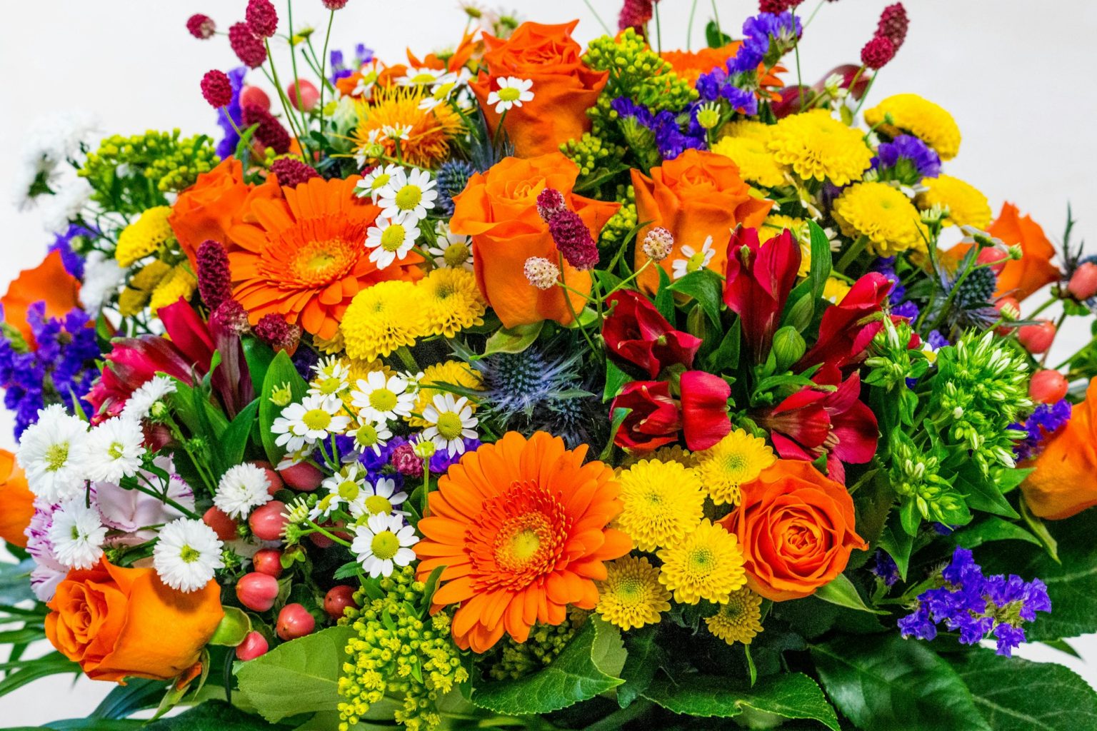
Jove Meyer is easy to recognize through color, but I don’t think color is actually the most useful lesson sitting in his work.
His studio describes a client-first process built around authenticity, vivid palettes and events that genuinely reflect the people being celebrated. He’s also consulted on event spaces with attention to both beauty and function. That combination gives the bright work a lot more substance than simple love of saturation.
Color is useful when it reveals character, not when it’s just loud
A strong palette can do more than make photographs lively. It can signal energy, loosen formality, clarify zones, give an event a visual identity before a single personalized object even appears.
What I take from Meyer’s approach is the permission to reject default celebration aesthetics when they simply don’t fit the host. Not every wedding needs to whisper. Restraint is a tool, not a moral achievement, and I get genuinely tired of it being treated as one.
At the same time, boldness works best when it’s edited. Five colors with defined roles feel intentional. Fifteen equally important colors just make every surface compete for custody of the room.
Inclusion has to show up in the floor plan
Meyer’s emphasis on welcoming, inclusive celebrations is worth carrying straight into the physical plan. Hospitality isn’t complete if a guest is technically invited but practically excluded by access, seating, signage, or assumptions baked into the event.
Those constraints make the design more interesting, honestly, because they force better questions about who the event is actually for and how different people will actually move through it.
Use color to reveal the people
Use the palette to express the people, not the category of event. Then test the room against the real guest list. The most personal design choice might be a color. It might just as easily be a clear path, a comfortable seat, or a menu that considered someone before they had to ask.
See the work: Jove Meyer Events
About the approach: Jove Meyer — About
Meet the 20 designers shaping this field guide · Personalization Beyond the Theme · The New Rules of Event Design
Atmosphere OS · Theme Atelier
Turn the mood into something a florist can quote.
Theme Atelier builds palette, materials, lighting and spatial mood into one system, then writes it in language a vendor can price. Every number it produces comes from a published rule, and the rulebook names the judgments it deliberately refuses to call rules.
Free to use, local-first in your browser, and there is no account until you ask for one.
Field notes and corrections
When a number here turns out to be wrong, you hear about it.
Three things arrive and nothing else. The new field note — bar rates, cover widths, service clearances, the arithmetic worked through on one real evening. A line when a World opens, because a night only goes up once it can actually be thrown. And a correction whenever a rule in the published rulebook changes, or a number the tools rely on turns out to have been wrong. There is no weekly slot, because there is nothing weekly to put in it.
One email per field note or opening, plus corrections when a published figure moves. Unsubscribe from any of them.
Continue through the system
Pretty is still not a plan.
A party gets planned in roughly this order. Pick the chapter where your next problem lives.
What you have to decide next
One decision constrains the next. This is the order they actually happen in.
More in this chapter


See the complete five-chapter Event Design Intelligence map →