Experimental Concepts
Summer Has Bad Manners
A saturated summer event theme built from heat, shade, splash, movement, vivid colour, and one collective cooldown—without tropical-party clichés.
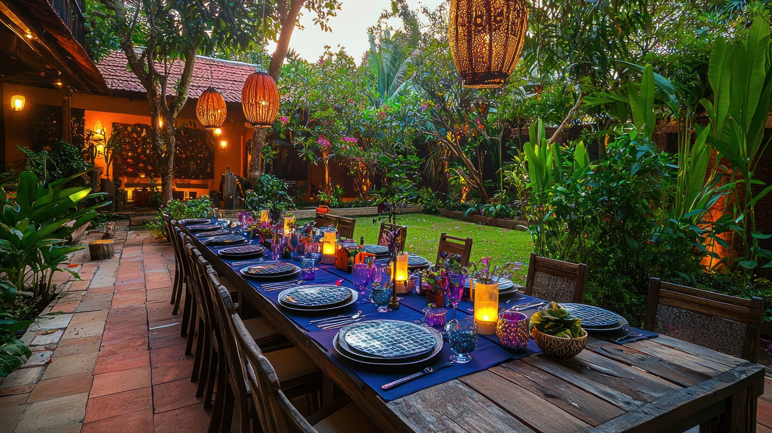
DESIGN ATELIER / ACTIVE THEME BUILD
Summer tracks water across the floor, steals the good chair, eats with its hands, and refuses to lower its voice.
Summer Has Bad Manners is saturated, unruly, funny, physical, and shamelessly alive. Heat, cold, shade, splash, fruit, sound, breeze, and movement behave like design materials. The season does not sit politely in a colour palette. It gets into everything.
This is grown-up sensory energy—not a tropical-party kit, not beige linen with brighter napkins, and not a poolside cliché that stops working the moment there is no pool.
Build around heat, appetite and bad behavior
Most summer events decorate the season. They add striped linen, citrus, a few bright flowers, and perhaps a drink with an umbrella. This theme lets summer act on the room.
A watermelon-pink colour field escapes the table and travels onto the ground. Shade hangs slightly too low in one place and lifts dramatically in another. Cold metal bowls sweat. Towels become graphic objects. Fans move in waves. Fabric will not hold still. A brief cooling mist interrupts the heat. Reflected blue light appears where no pool exists.
The result should feel like summer has taken over the event’s manners but not its operations. The room is vivid and slightly unruly. The hospitality remains excellent.
The human result is not “everyone saw the summer décor.” It is: people felt the season changing around them and knew the event had planned for their bodies, not just the photographs.
Personality before prettiness
The personality is physical, generous, loud in colour, and mildly disobedient. It steals straight lines. It moves the shade. It leaves a wet ring. It puts the coldest drink exactly where the heat is beginning to win.
Its humour comes from recognisable summer behaviour. The tablecloth that escaped. The fan that became architecture. The colour spill nobody rushed to clean. The frozen dessert that arrives because the afternoon has become unreasonable.
The room is vivid and slightly unruly. The hospitality remains excellent.
It should never feel sloppy, juvenile, or careless. “Bad manners” is the event’s wit, not permission for sticky floors, poor service, heat exposure, waste, or a dangerous water feature.
Summer gets to be unruly; the systems do not
Every unruly gesture must improve the summer experience. The spill connects the room. The shade lowers the temperature. The towel offers comfort. The mist cools without soaking. The inflatable creates architecture. If a move is merely loud, plastic, or inconvenient, summer can take it back.
Spaces summer can actually use
A community festival or public cultural programme: shade, hydration, food, music, and a clear weather plan become part of one strong visual system instead of separate operational afterthoughts.
A family reunion: multiple generations can share one bright atmosphere with different heat, noise, seating, and activity options. The theme does not depend on everyone behaving like a pool-party model.
An employee picnic or company summer gathering: useful comfort replaces branded giveaways. Staff experience the event as hospitality rather than mandatory outdoor endurance.
A rooftop, backyard, courtyard, or milestone party: the season supplies the drama. The build can be light if the colour, shade, food, movement, and cooling reveal are exact.
A summer campaign or launch: products and messages live inside a believable seasonal world rather than a trade-show booth with beach props.
A colourful warm-weather wedding: it works when the people want saturated, physical summer energy. It does not need an arch, aisle installation, palm leaves, or generic resort styling to identify the occasion.
The guest journey
The experience moves through a thermal plot: heat announced, hot and cool alternated, then one collective cooldown. The body understands the sequence before the guest has words for the theme.
01 / The heat line
Arrival begins with a visible line of colour, shade, moving air, cold drinks, and somewhere to set things down. Summer has already occupied the route. Guests understand immediately that heat management is part of the design.
02 / Hot and cool
The middle alternates intensity: sun-bright food, charcoal and grill heat, chilled metal, wet reflections, striped shade, breezy fabric, quiet cool seating, and brief splash or mist moments. No single zone has to do everything.
03 / Everybody cools down
The finale changes the thermal and visual register together: moving shade, a mist passage, frozen course, reflected-water light, released breeze, or sunset colour wash. The room experiences relief as one shared event.
The signature move: the Bad-Manners Spill
One saturated colour refuses to remain where it was assigned. It begins on a table, sign, canopy, or service piece and appears to spill across linens, furniture, food, clothing details, vessels, and the ground. It can widen, drip, streak, pool, climb, or jump—but its behaviour must be readable.
For the first build, Watermelon Spill is the obvious lead. A pink textile runs down the table, ignores the hem, crosses a painted or textile ground panel, reappears on a bench, stains the edge of a menu, and finally becomes the sunset light. The colour tells the guest these separate things belong to one event.
The spill should travel through different materials rather than becoming one enormous flat graphic. Matte fabric, glossy enamel, translucent acrylic, reflected light, food colour, and a painted fan will all make the same hue behave differently.
Do not let the spill cover everything. It needs resistance: blue reflection, lime movement, dark shade, white towels, bare grass, existing stone, and moments where the colour stops abruptly. Bad manners are fun because the room still has rules to break.
The thermal choreography
Colour gives this world its nerve, but temperature gives it credibility. A summer event cannot simply look hot and ask guests to admire the effort.
Heat should be felt selectively
Use grill smoke at a safe distance, sun-warmed colour, warm food, dry texture, percussion, tangerine light, and open movement. Guests should sense energy without being left in direct sun or pushed toward an overheated crowd.
Coolness should arrive before discomfort
Shade, hydration, chilled metal, moving air, cold food, wet reflection, blue light, quieter sound, and seating can make a cool zone legible before a guest needs it. The best cooling station does not look like emergency equipment brought out after the design failed.
The rhythm matters
Hot beside cool is more interesting than one uniformly pleasant temperature. A bright grill route can hand off to a pool-blue drinks station. A sunny table can end in a lilac shade room. The finale works because the event has built enough heat and movement for collective relief to mean something.
The visual world
The visual DNA is wet-look surfaces, overscale stripes, chunky fruit colour without literal fruit props, translucent vessels, painted fans, architectural inflatables, mesh, towels, enamel, cold metal, moving fabric, and exaggerated pools of colour.
Colour gives this world its nerve, but temperature gives it credibility.
At distance, guests see one Bad-Manners Spill, a clear shade landscape, and a hot-to-cool route. At hand level, they notice condensation, glossy edges, mesh shadows, cold trays, cloth loops, fruit-coloured food, and small colour transfers from one object to the next.
The shapes should feel simple and physical: long bands, broad stripes, rounded pools, one swollen form, and a few hard reflective rectangles. Too many decorative motifs will turn it into a party-store collection.
Typography can be bold and direct, with condensed numbers for temperature, time, route, or service cues. Avoid retro tiki lettering, beach-club scripts, and faux hand-painted tropical signs.
The 12-colour weather system
This palette is an event-wide inventory, not a demand to show twelve colours in every photograph. The power brights carry shade, ground, furniture, linens, and major service zones. Supporting colours create motion and transitions. Dark anchors make the saturation sophisticated. Light resets keep signs, food, and skin tones readable. Cold Metal appears as a real finish, not grey paint pretending to shine.
The zone recipe
One temperature, four colour jobs. Choose one dominant bright, one moving support, one dark anchor, and one light reset. Add Cold Metal only where touch, reflection, or temperature makes it meaningful. The complete palette belongs to the whole event; each view needs a hierarchy.
1 / The power field — 54%
These four colours do the structural work. They occupy the largest planes and give the event its unmistakable summer voltage.
WATERMELON SPILL
#FF3F6C / 18%
The signature escape colour. Long textiles, ground pools, benches, menus, and the sunset handoff.
TANGERINE HEAT
#FF7A00 / 14%
Hot food, sun-facing shade, service movement, light, and the energetic middle.
CHLORINE BLUE
#00AEEF / 12%
Water reflection without requiring a pool, drinks, translucent planes, and cooling routes.
LIME FAN
#B7E532 / 10%
Moving air, portable shade details, wayfinding, small furniture, and kinetic accents.
2 / The moving colours — 24%
These secondary vivids change the temperature, keep the four core colours from reading like a brand package, and give the event enough range for food, light, fabric, and after-dark moments.
POPSICLE YELLOW
#FFD43B / 9%
Daylight, frozen treats, stripe interruptions, warmth, and the arrival heat line.
HEATWAVE MAGENTA
#F22998 / 8%
Fruit colour, flowers, fabric undersides, evening energy, and playful intensity.
AFTER-SUN VIOLET
#7047EB / 7%
Shade depth, the transition toward evening, projection, and the cooldown finale.
3 / The contrast anchors — 12%
These colours give the brights edges, shadow, type, and visual gravity. They are especially important when sunlight flattens lighter colours.
DEEP WATER
#082E57 / 7%
Shade structures, evening ground, type, cooling stations, and reflected depth.
SHADE INK
#15151F / 5%
Primary typography, hardware, thin stripes, grill details, and hard contrast.
4 / The visual resets — 8%
These are practical breaths: reading surfaces, towels, menus, food backgrounds, and visual relief between saturated zones.
TOWEL WHITE
#F7F8F4 / 6%
Text, table pauses, cooling textiles, service surfaces, and clean contrast.
MELTWATER
#DDF6FF / 2%
Mist, translucent shade, quiet cool zones, projection glow, and visual air.
5 / The cold punctuation — 2%
COLD METAL
#D8E1E7 / 2%
Use the hex in print and screen; use stainless steel, aluminium, mirrored film, or another genuinely cool reflective finish in the room. It belongs in bowls, trays, shade hardware, drink stations, and one sharp reflected edge.
Hue, value, and chroma
HUE
Warm and cool in active argument. Watermelon, orange, yellow, and magenta push heat forward. Blue, violet, and lime interrupt it with splash, shade, and movement.
VALUE
Mid-value brights with real depth and light. Deep Water and Shade Ink keep forms legible; Towel White and Meltwater give the eye and typography somewhere to recover.
CHROMA
Clear, saturated, and unapologetic. No dusty coral, faded denim, muddy mustard, or “safer” sage. Reduce coloured area when needed; do not drain the personality.
Five zone palettes inside the larger system
The heat line: Tangerine Heat, Popsicle Yellow, Shade Ink, and Towel White. Bright, direct, and readable in hard daylight.
The table spill: Watermelon Spill, Heatwave Magenta, Towel White, and Cold Metal. Food, hands, fabric, and gloss carry the mischief.
The cooling station: Chlorine Blue, Meltwater, Deep Water, and Lime Fan. Cold, moving, and visibly useful.
The shade room: After-Sun Violet, Deep Water, Lime Fan, and Towel White. Lower stimulation without becoming beige.
The sunset finale: Watermelon Spill returns through light, After-Sun Violet deepens the edges, Chlorine Blue flickers in reflection, and Shade Ink sharpens silhouettes.
Materials that behave like summer
Striped shade cloth and fire-rated fabric: overscale stripes should create real thermal relief. Let the pattern turn corners, overlap, or change width rather than repeating like rented cabana décor.
Mesh: useful for moving shadow, breathable walls, layered colour, fan guards, storage, and soft spatial division. It should look intentional, not like hardware-store netting added at the last minute.
Translucent acrylic and polycarbonate: for reflected colour, drink stations, edges, vessels, and shallow visual “pools.” Use carefully outdoors; glare and heat buildup are real.
Enamel and cold metal: bowls, trays, water stations, tubs, service pieces, and hardware should feel cool to the eye and, where safe, to the hand.
Towels and absorbent textile: not spa stacks. Use large colour fields, loops, rolled forms, seat covers, hand towels, and practical drying points. A material with a job has more personality.
Architectural inflatables: shade, soft wall, overhead volume, or an exaggerated rounded form. Specify durable reusable pieces with proper ballast and repair plans. Inflatable does not mean disposable.
Water and mist: use only when drainage, slip, reach, wind, guest consent, equipment, and local restrictions are solved. Reflected light can create water behaviour without introducing actual water.
Shade is architecture
Shade cannot be a handful of umbrellas floating beside the design. It determines where people stay, how food holds, where older guests sit, whether children can pause, and how long the event remains enjoyable.
Create a visible shade landscape with different heights and behaviours: one long striped canopy, smaller tilted sails, a darker quiet pocket, a fabric edge that moves, and an arrival zone that offers immediate relief. Chairs belong where the shade will be, not where it appeared on the first site visit.
Track the sun across the actual event hours. A beautiful canopy that misses the table by six feet at dinner is sculpture, not hospitality. This is where the guest journey becomes a floor plan people can feel—and, in this case, feel on their skin.
Weather is not an emergency addendum
A summer world needs a full weather plan because heat, wind, sun, smoke, lightning, and rain can change the experience faster than décor can.
Heat
Set shade and water capacity for the actual guest count. Create seated cool zones, staff hydration, refill points, and a direct path indoors or to conditioned space. Do not wait for someone to ask for relief.
Wind
Engineer shade, fabric, inflatables, signs, trays, and tall arrangements. Decide what comes down first as wind rises. Movement should look deliberate; unsecured objects should not become projectiles.
Smoke or poor air quality
Outdoor summer events increasingly need an indoor or filtered-air route. The theme can move inside through colour, fans, reflective light, chilled service, and fabric. A pool is optional; clean air is not.
Lightning
Mist and water stop. Electrical equipment is secured. Guests move to the identified safe structure. The relocation cue must be clear and must not compete with playful event language.
Rain
Treat it as a material only after shelter, drainage, traction, towels, power protection, and access have been solved. Summer can have bad manners. Production cannot.
Production Is Event Design is the companion principle: the weather plan belongs inside the visual and guest-experience decisions from the beginning.
Accessibility and sensory choice
The coolest, quietest, most comfortable route should be as visually strong as the high-energy areas. Step-free shade, stable surfaces, reachable hydration, seating with backs and arms, clear routes, and restrooms must be obvious.
A pool is optional; clean air is not.
Mist should always have a dry bypass. Fans should not blast directly at guests who cannot regulate temperature or dislike strong air movement. Water reflections should not create disorienting glare. Music and percussion need a lower-sound option.
Use colour with words, symbols, and physical form; do not depend on hue alone for hot/cool routing. Make hand fans easy to operate. Place towels and water at several heights. Keep extension cords, hoses, drainage mats, and equipment out of the accessible route.
Children, older adults, pregnant guests, people using medication, and people with health or sensory considerations may experience heat very differently. The event does not need medical language everywhere. It needs genuine options.
Light: hard day, wet reflection, violet evening
In daylight, use the sun rather than fighting it. Matte brights hold large planes; glossy surfaces create smaller flashes; mesh and stripes make moving shadow. Avoid acres of reflective material where glare will make guests squint.
As the day moves, let colour take over from sunlight. Water-reflected light can ripple across a wall or canopy without a literal pool. After-Sun Violet deepens shade. Watermelon Spill returns as a low sunset wash. Chlorine Blue becomes cooler and more luminous.
The finale should feel like a weather change rather than standard uplighting. A canopy can move. Fans can begin together. A cool mist can pass outside the dry route. Reflected light can spread across the ground. Frozen service can arrive as the colour temperature changes.
For the broader principle, see Color Should Move the Guest, Not Decorate the Room.
Sound and movement
Summer is not quiet, but noise should have shape. Use percussion, bass, laughter, fan movement, ice, metal, water, and fabric as a changing sound field. The hot zones can carry more rhythm. The shaded areas can soften it.
A collective sound shift can help the cooldown finale: percussion drops, a lower pulse arrives, fabric releases, fans begin, or the room hears ice and water before the frozen course appears.
No guest needs to dance, shout, splash, or perform. Movement can live in the materials and service when people want a calmer experience.
Food should have temperature and colour
The menu should feel physically right for the event, not simply summer-labelled. Cold, crisp, juicy, charred, salted, frozen, dripping, and hand-held textures can alternate just as the rooms do.
Use real fruit colour rather than literal fruit props. Watermelon pink can come through radish, berries, hibiscus, tomato, stone fruit, or a vivid frozen course. Tangerine may be citrus, pepper, glaze, grilled fruit, or light. Chlorine Blue belongs in vessels and reflection—not artificial blue food by default.
Cold metal bowls, enamel trays, translucent cups, insulated water stations, chilled plates, and cloth for condensation can make temperature visible. Food safety, allergens, holding time, shade, insects, and replenishment remain part of the design.
A good service rhythm might open with cold drinks, move through bright hand-held food, introduce one charred hot moment, return to chilled bowls, and end with a frozen reveal. The menu participates in the thermal plot.
Flowers and botanical material
Flowers are not required. If they appear, use bold colour masses, sturdy sculptural stems, fragrant herbs, fruiting branches, edible leaves, or graphic botanical shapes that tolerate the conditions.
Keep delicate flowers out of direct heat unless the short lifespan is understood. Shade and water access matter. Do not hide wilting arrangements behind “organic” language.
Avoid palm-leaf shorthand, tropical costume, flamingos, pineapple props, and generic monstera everywhere. A summer event can be vibrant without borrowing an imagined resort culture.
One tub of magenta flowers under lime shade may be enough. The moving fabric, food, people, and reflected colour already provide abundance.
Useful guest objects
A hand fan, towel, refillable cup, seat cover, shade clip, or chilled neck cloth can become part of the colour system and improve the actual event. That is a better takeaway than disposable sunglasses printed with a logo.
Offer objects where they are useful and provide a return point for anything reusable. Washable textiles, durable fans, enamel or rental drinkware, repairable inflatables, and modular shade deserve priority over single-use plastic.
Wardrobe can carry colour through broad solids, useful aprons, towels, fan belts, or staff pieces. Do not prescribe tropical costume or turn guests into a matching campaign image.
Scale without losing the bad manners
The theme scales through the thermal sequence, Bad-Manners Spill, and distributed comfort—not through larger quantities of novelty décor.
2–20 guests / The Escaped Table
One oversized striped shade, one Watermelon Spill running from table to grass or floor, cold metal service, bright towels, lime fans, and one cooling reveal. The small version should feel complete, not like a sample.
21–75 guests / Hot Side, Cool Side
Create separate hot and cool zones, portable fans, graphic ground pieces, one moving fabric installation, distributed water, and a bold drink or frozen-dessert station. Let the spill connect both temperatures.
76–150 guests / The Moving Weather
Build a visible shade system, larger reflective surfaces, timed mist or breeze, several hydration points, repeated cool seating, and a sunset transition. Service and sound should move instead of forcing everyone toward one station.
151–400 guests / Summer District
Use modular engineered shade, water-safe circulation, large colour fields, multiple cooling stations, accessible dry routes, weather monitoring, reusable kinetic pieces, and a mass finale that does not rely on one machine or single-use décor.
At every scale, the same question applies: can a guest feel the heat/cool rhythm, follow the spill, find relief without asking, and recognise the collective cooldown? That is how one event survives at many scales.
Three budget routes
LIGHT
Protect: painted or textile ground pieces, one excellent striped canopy, fruit-colour food, reflective trays, fans, useful towels, and a disciplined wardrobe note.
Spend on shade, water, food safety, and one cooling reveal before decorative extras.
CORE
Add: custom modular shade, reusable architectural inflatables, timed mist or breeze, translucent furniture accents, distributed cooling, and a live sound shift.
This is the useful sweet spot: visibly transformed, physically comfortable, and reusable.
FULL
Build: an architectural shade landscape, choreographed breeze, mist and light, sculptural cooling stations, engineered reflective ground or shallow-water element, and a large sunset transformation.
The budget should improve thermal experience and scale—not purchase more summer symbols.
Venue fit—and why a pool is unnecessary
Excellent: courtyards, lawns, rooftops, public plazas, gardens, warehouses with outdoor access, pool decks with proper operations, and indoor-outdoor venues that can support a real temperature transition.
Strong indoors: use moving air, striped ceiling fabric, reflected-water light, cold metal, translucent vessels, wet-look finishes, food temperature, towels, sound, and a projected sunset. The concept remains summer even without weather exposure.
Small backyard: one oversized canopy, a table spill, fan movement, cold food, and blue reflected light can do nearly everything the idea needs.
Needs caution: exposed rooftops with limited ballast, sites without reliable shade or water, fire-prone landscapes, venues with poor drainage, or places where heat and smoke plans cannot be supported. Reduce the build or move inside rather than romanticising risk.
What production actually needs
A thermal map: mark sun, shade, reflected heat, airflow, water, food, power, seating, and indoor relief for the actual event hours. This is one useful sheet, not a governance system.
A weather decision: identify who monitors conditions, the thresholds for reducing or stopping mist, shade movement, inflatables, sound, and outdoor activity, and the location of the indoor or safe route.
Engineered shade and ballast: manufacturer guidance and venue approval matter. Decorative intuition is not wind engineering.
Reduce the build or move inside rather than romanticising risk.
Water management: drinking-water supply, mist quality, hoses, drainage, mats, dry bypasses, cleaning, slip checks, and local restrictions must be resolved before guest arrival.
Protected power: use appropriate outdoor equipment, cable protection, and ground-fault protection. Separate guests, water, and electrical connections.
Food temperature control: cold holding, hot holding, replenishment, ice, insects, shade, waste, and staff hydration need equal attention.
A low-waste strike: sort rental and reusable materials, wet textiles, recycling, food waste, water equipment, and damaged pieces. Dry everything before storage.
For a realistic division between self-made colour work and hired infrastructure, see DIY Event Design: What to Hire.
The optional mini book: Bad Manners for Summer
Bad Manners for Summer can be a compact seasonal book of playful rules, cooling tricks, recipes, field notes, and blank pages for “things summer got away with.” It should feel like an artful field guide passed between friends, not a children’s activity booklet.
A possible structure
Rule 01: Sit where the shade will be. Rule 02: Cold drinks need more ice than optimism. Rule 03: Let one colour escape. Rule 04: Eat the good fruit over the sink. Rule 05: Move the party before the weather does. Last pages: recipes, cooling notes, what survived, and blank evidence of summer’s behaviour.
The book earns its place when the event includes recipes, weather intelligence, family stories, community notes, or a campaign worth carrying forward. If the day itself is the entire point, one folded rule sheet may be enough.
Invitation and event language
WEATHER NOTICE
Summer has already arrived and is behaving accordingly.
Expect colour outside its assigned area, food best eaten with your hands, moving shade, cold drinks, excellent towels, and one collective cooldown. Dress for heat. A dry route and quieter shade will be available.
Useful language includes The Heat Line, Cool Side, Shade Worth Stealing, Spill in Progress, Towels Have Jobs, Cold Things This Way, After-Sun, Weather Permitting, and Summer Got Away With It. Keep operational information plain and separate from the jokes.
Avoid “tropical paradise,” “island time,” “aloha,” “fiesta” as generic colour language, “good vibes only,” and any wording that borrows cultural identity or suggests weather planning is optional.
The three images this theme must survive
01 / Hero world
Wide high-end editorial event photograph across a courtyard and lawn in strong summer daylight. One Watermelon Spill travels from a long table onto the ground and reappears on furniture; tangerine overscale striped shade hangs asymmetrically but safely; chlorine-blue reflective planes and translucent vessels suggest water without requiring a pool; lime fans and moving fabric animate the scene; popsicle-yellow food and after-sun violet shade add depth. Multigenerational guests in bold solids, real seating, practical hydration, dimensional shadows, luminous highlights, tactile materials, buildable weather plan. No palm leaves, tiki décor, flamingos, boho beige, wedding arch, disposable balloon wall, branded resort styling, CGI gloss, impossible shade structure, logos, or text.
02 / Human moment
Candid close-to-mid high-end editorial event photograph of mixed-age guests laughing as a brief cooling mist passes beside a saturated summer table, with a clearly visible dry bypass. Chilled metal bowls, bright towels, translucent cups, moving striped fabric, sunlight and water reflections, realistic slightly messy hands, natural imperfection, deep foreground-to-background detail. No staged pool-party posing, branded swimwear, tropical costume, forced splash, unsafe wet floor, disposable plastic clutter, or gibberish text.
03 / Small-scale translation
High-end editorial photograph of a backyard meal for sixteen using the same concept. One oversized engineered striped canopy, a single Watermelon Spill cloth deliberately running from table to grass, chlorine-blue enamel trays, lime hand fans, cold metal bowls, practical water station, real seating with shade, vivid food, warm directional light, believable household scale. Attainable and layered, with no luxury-resort cues, wedding styling, balloon décor, palm props, impossible geometry, or visible text.
The images must prove that colour is structural, cooling is real, the people are not default wedding models, and the personality survives without a pool or luxury venue.
What would ruin it
Palm-leaf shorthand. Summer is larger and stranger than one tropical motif.
Tiki or borrowed island imagery. Cultural costume is not a substitute for a seasonal premise.
Flamingos, pineapples, and novelty beach signs. Literal icons shrink the world into a party aisle.
Boho neutrals. Beige is not required to make bright colour sophisticated.
Disposable inflatables and plastic clutter. Soft architecture should be durable, useful, repairable, and properly secured.
A design that only works beside a pool. Reflected light, cold metal, mist, food, shade, and movement can carry water behaviour anywhere.
Heat treated as atmosphere. Guests require shade, hydration, seating, and relief before heat becomes dangerous.
Wet floors as a joke. Every water or mist element needs drainage, traction, a dry route, and active monitoring.
All twelve colours everywhere. The palette creates several coordinated weather zones, not visual soup.
Single-use “fun.” Confetti, balloons, plastic props, and giveaway objects cannot become the main evidence of energy.
A finale that depends on perfect weather. The cooldown must have a strong indoor or dry alternative.
The first prototype
Build the sixteen-person backyard version first. Use one striped shade, one table-to-ground Watermelon Spill, cold metal bowls, chlorine-blue reflection, lime fans, useful towels, a visible water station, and one frozen or breeze-led cooldown.
Test it during the actual event hours. Watch the sun. Measure where the shade lands. Sit in every chair. Check glare, wind, fabric movement, food holding, water access, mist drift, surface traction, and whether the spill reads from the arrival point.
Invite several people with different relationships to heat, noise, and mobility. See whether they find strong options without asking. Then improve the thermal and guest behaviour before adding more colour or scenery.
The final test
If summer changes how the room moves, eats, cools, sounds, and gathers, the theme is alive.
If it only added watermelon napkins and a striped umbrella, summer has better things to do.
Return to the Design Atelier for theme systems built from guest behaviour, atmosphere, materials, and production reality.
Atmosphere OS · Theme Atelier
Where the feeling stops being a photograph.
Theme Atelier converts a direction into a documented design system with the lighting and material consequences attached. It runs in your browser and stays there until you decide the project is worth saving.
Costs come back as indicative bands rather than quotes, and seasonal notes are filters rather than promises.
Continue through the system
Pretty is still not a plan.
This field note belongs to a larger event-design system. Follow the chapter that explains the next pressure point instead of falling back into an undifferentiated archive.
What you have to decide next
One decision constrains the next. This is the order they actually happen in.
- Venue Will this room hold it? The Generator Was Late. The Washrooms Were Waiting.
- Guest experience How will guests move through it? Family Milestone Reception for One Hundred Fifty: Three Generations Need More Than One Volume Level
- Production How does it get built and run? Museum Reception for One Hundred Forty: The Building Gets a Vote
- Vendors Who owns each handoff? The Dance Floor Wrap Is Not the Whole Dance Floor
More in this chapter


See the complete five-chapter Event Design Intelligence map →