Atmosphere
Color Should Move the Guest, Not Decorate the Room
Everything matched. Nothing happened. Color earns its place when it moves through the evening instead of sitting on every surface agreeing with itself.
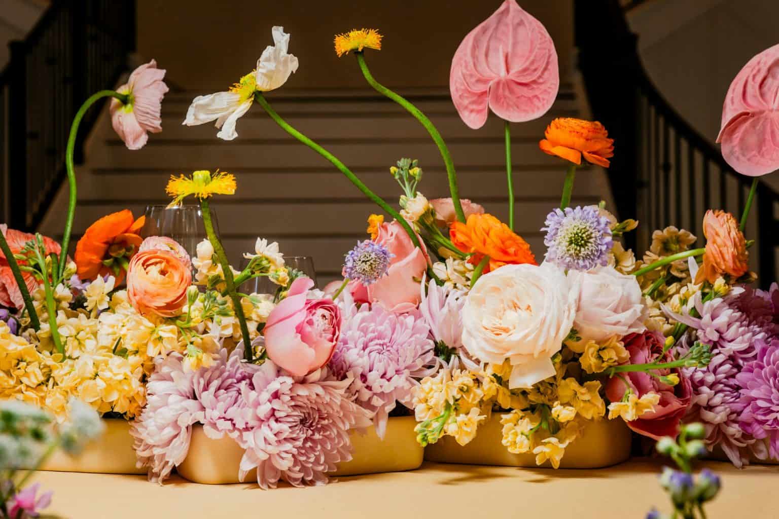
Everything matched. Nothing happened.
Burgundy in the flowers, burgundy napkins, burgundy menus, burgundy candles, burgundy on the signage. Every object in complete agreement. The room looks finished, in the sense that a catalogue page looks finished.
And the guest experience never changes once, all night, because the color was used as matching rather than as movement.
Color gets interesting the moment it has a job in the sequence. It can make arrival feel quieter than the street outside. It can turn dinner warmer as the daylight leaves. It can sharpen the shift into dancing, and let the last lounge feel darker and more private than the room people walked into four hours earlier.
Describe the temperature before you pick the swatches
Smoky and intimate. Sun-warmed and generous. Graphic and energetic. Garden-dark and romantic. Pale and ceremonial. Saturated and nocturnal.
Any of those tells you more about what to do next than five hex values do.
Then decide where the evening should be most intense and where it should breathe. A palette does not owe anyone equal distribution. Hold the strongest color back for the room or the moment that has earned the visual weight.
Something has to be carrying the room
Color reads as intentional when the eye can tell what the dominant field is. That might be the architecture, the landscape, the linen, a wall, dark furniture, candlelit shadow, or a broad floral mass. It does not have to be the most saturated thing in the room — it is simply the condition everything else is responding to.
Once that is clear, accents can do far more with far less. A deep berry flower against warm ivory is a different object from the same flower surrounded by five competing jewel tones. A small acid-green note in a dark plum room creates tension without anyone having to buy an entire category of green.
Do not spend the whole palette at the front door
The threshold only needs enough color to say you are somewhere else now. One material or hue that will matter later is plenty.
A palette does not owe anyone equal distribution.
A dark floral gesture. A wine-colored textile. A warm brass reflection. One deliberate colored light cue. Introduce the language, then let the larger room deepen or complicate it.
Sequence gives the palette somewhere to go. Spend it all in the entry and everything afterwards is a repeat.
Chapters, not separate themes
An evening moves through ceremony, drinks, dinner, program, dancing, departure. Those can share one palette and still change emphasis.
- Arrival: quieter contrast, one recognisable cue.
- Gathering: more open neutrals and natural material, so people and service stay legible.
- Dinner: deeper saturation near the table — textiles, flowers, glass, reflected light.
- Program or dancing: stronger contrast, darker fields, more energetic light where it suits.
- Departure: useful light and a return to clarity, rather than an abrupt visual shutdown.
The specifics depend entirely on the venue. The principle does not: color can mark progression without requiring a brand-new concept in every room. What it is marking is the route guests actually walk, so plan it in that order.
A palette approved under office lighting is fiction
Color and light are the same subject. Deep textiles go nearly black in a dim room. Pale surfaces either glow under warm sources or turn faintly grey and sad under the wrong ones. Glass, metallics, glossy leaves, stone and water all rewrite whatever is next to them.
Mock up the combinations that matter in the actual event-hour lighting state, and if the room travels from daylight to evening, test both. Never approve a candlelit palette under bright setup lights, which flatter nothing and lie about everything. It is one more argument for treating light as the decision the palette answers to.
Neutral is not filler
Ivory creates breathing room around saturated flowers. Black grounds a romantic palette. Warm wood bridges pale textiles and dark foliage. Stone cools a palette that has gone slightly too sweet.
Neutrals control visual density, which is another way of saying they decide what gets noticed. When every surface carries strong color, nothing has hierarchy. A quieter field makes the saturated moments look more expensive, purely because they are finally allowed to be seen.
People still have to read the table number
Menus, signs, place cards, table numbers, steps and paths need enough contrast to be usable. A beautiful low-contrast palette should not turn finding your seat into a task.
Treat accessibility and legible contrast as part of the design rather than something corrected later. The room stays moody; the critical information gets clearer through type, scale, light, placement, or a smarter material pairing.
Flowers are not a paint strip
Natural material contains variation, and the variation is the good part. A flower called burgundy carries brown, plum, red or near-black depending on the day it opened. Foliage brings blue-green, yellow-green, silver, or something nearly black.
When every surface carries strong color, nothing has hierarchy.
Those shifts almost always make a palette richer than exact matching would. Brief the florist on the relationship you want — dark mass, warm undertone, pale relief, one sharp accent — rather than asking every stem to impersonate a digital swatch. Let qualified floral professionals advise on availability and how material behaves in the actual season and conditions.
Cut anything that is only agreeing
When the palette starts getting busy, look for duplication. The table already has deep berry linen and deep berry flowers; the menu does not also need a berry border. The brass lighting is already providing warmth; every vessel does not need to be gold. The venue is handing you a great deal of natural green for free; artificial green may be adding nothing but cost.
Color feels deliberate when each appearance changes the composition rather than proving the palette exists.
The grayscale test
Picture the room with the color drained out. Is there still a hierarchy of light and dark, large and small, dense and quiet? If everything has roughly the same weight, color is doing structural work it was never designed to do.
Then put the palette back and ask where the eye goes first, second and third. If the answer is “everywhere,” take out one saturated layer or strengthen the dominant field.
The color worth having is the one nobody can name afterwards
Not the palette guests could list back to you. The one that made the room warmer, darker, stranger, softer, more ceremonial or more alive at exactly the right moment, without ever introducing itself.
Use color as sequence, contrast and emotional temperature. Let it move with the evening instead of sitting on every surface like proof that somebody chose a palette.
Confirm accessibility and visual-legibility requirements, lighting and electrical conditions, material restrictions, flame rules, and venue-specific operating requirements with the venue and appropriately qualified providers where applicable.
Atmosphere OS · Theme Atelier
A palette is not yet a decision.
Atmosphere OS holds the colour, the material, the light and the room in one object, so moving any of them shows you what it does to the rest. Costs come back as indicative bands and never as quotes, which is the difference between planning and pretending.
The rulebook is public. Every formula it runs on is written down where you can disagree with it.
Continue through the system
Pretty is still not a plan.
This field note belongs to a larger event-design system. Follow the chapter that explains the next pressure point instead of falling back into an undifferentiated archive.
What you have to decide next
One decision constrains the next. This is the order they actually happen in.
- Venue Will this room hold it? When Prismm Goes Dark: The Deadline Is September, Not December
- Production How does it get built and run? Ask It Twice: Why the Same Evening Comes Back With Five Different Answers
- Vendors Who owns each handoff? The Generator Was Late. The Washrooms Were Waiting.
- Contingency What happens if the weather turns? The Storm Wasn’t the First Failure
More in this chapter


See the complete five-chapter Event Design Intelligence map →