Occasions & Formats
How to Host a Large-Feeling Dinner in a Very Small Room
A small room doesn't have to feel small. The ones that work never pretend to be large; they use the constraint as material and protect the movement.
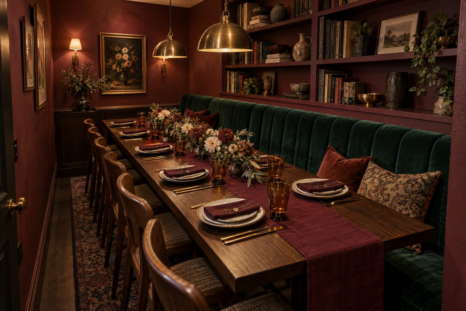
A small room doesn’t have to feel small. It can feel focused and genuinely generous, if the decisions get made in the right order.
The small rooms that actually work never pretend they’re large. They use the constraint as design material instead of fighting it, and they protect the movement the room genuinely needs.
Cut the number of objects, not the quality of them
Every extra chair or side table competes for air in a room like this. Keep only what the meal and the atmosphere actually require. One strong table, the right seat count, and a few supporting pieces read as intentional. A room straining to hold everything a bigger space could just reads as cramped.
Use the walls and the air above the table
When the floor is limited, the vertical space becomes the real opportunity. Lighting that draws the eye upward, one strong wall moment, and a centerpiece that gains height while staying narrow all expand the perceived volume without adding an inch of footprint. Narrow is the operative word, since anything that blocks a face has stopped being decor.
Choose a table sized for actual movement, not maximum coverage
Measure the room with people in it, not just with furniture drawings. The number a venue quotes and the number the room can actually host well are rarely the same number. Real clearance for sitting and serving. A slightly smaller table that lets everyone move easily will feel bigger than a maximum-size table that forces a negotiation every time someone needs to pass.
Limit the palette more than you think you need to
Small rooms amplify visual noise fast. Fewer colors and repeated materials read as calm, and the eye reads calm as spaciousness. A busy high-contrast scheme in a tight footprint feels far more crowded than the square footage actually warrants.
Control the lighting like it’s doing structural work, because it is
Overhead light that’s too bright or too even flattens a small room and pushes the walls closer. Use layered, directional light that creates pools and soft edges instead, and avoid anything that draws attention straight to the boundary of the space.
Make the arrival and the exit genuinely clean
The first and last moments matter more here because there’s so much less buffer to absorb a mistake. Clear entry, a real place for coats that isn’t the dining zone, a path out as simple as the path in. In a room this size the first thirty seconds set the tone for the rest of it.
Nobody needs to be fooled about the size. The room only has to look as though it chose to be this small, and then guests remember the evening instead of the square footage.
Atmosphere OS · Moodboard-to-Plan
Turn the reference images into something buildable.
Moodboard-to-Plan reads the direction and returns layered plans in vendor language, with the material and lighting consequences attached. Every judgment runs against a written rule rather than a fresh guess.
Costs come back as indicative bands rather than quotes, and seasonal notes are filters rather than promises.
Field notes and corrections
When a number here turns out to be wrong, you hear about it.
Three things arrive and nothing else. The new field note — bar rates, cover widths, service clearances, the arithmetic worked through on one real evening. A line when a World opens, because a night only goes up once it can actually be thrown. And a correction whenever a rule in the published rulebook changes, or a number the tools rely on turns out to have been wrong. There is no weekly slot, because there is nothing weekly to put in it.
One email per field note or opening, plus corrections when a published figure moves. Unsubscribe from any of them.
Continue through the system
Pretty is still not a plan.
A party gets planned in roughly this order. Pick the chapter where your next problem lives.
What you have to decide next
One decision constrains the next. This is the order they actually happen in.
More in this chapter
See the complete five-chapter Event Design Intelligence map →