Atmosphere
Concept vs. Theme: How to Keep the Event From Looking Like a Costume
Moons on the menus, stars on the napkins, constellations on the signs. That is not celestial. That is a gift shop. Theme is source material, not a shopping list.
Moons on the menus. Stars on the napkins. Constellations on the signage. Galaxy lighting. A favor shaped like a small telescope.
That is not a celestial event. That is a gift shop.
A theme tells you what the event references. A concept tells you how the event should feel. Mix them up and a genuinely good starting point — forest, celestial, vintage cinema, peacock, desert, gothic romance — turns into a room full of objects explaining themselves to guests who had already understood.
Recognizable references are fine. I like a theme that commits. The actual work is deciding which qualities of it are worth translating into atmosphere and which ones belong in the costume bin.
Personalization Beyond the Theme has the designer-side context — how Bryan Rafanelli, David Stark, Jove Meyer and others use specificity where a literal theme would have gone.
Write down the adjectives before you buy the nouns
When a theme arrives, the temptation is to go shopping for its most obvious objects immediately. Resist for about an hour and write the qualities instead.
A forest is shadowed, vertical, layered, damp, green, bark-textured, quiet, directional. A peacock is iridescent, jewel-dark, proud, curved, reflective, faintly theatrical. Vintage cinema is low-lit, graphic, glamorous, sequential, built entirely around the reveal.
Every one of those can be delivered through light, palette, furniture, flowers, sound, material, spatial sequence and service. That is a far wider set of moves than a list of props will ever give you.
One sentence, and then use it as a filter
Turn the qualities into a single sentence describing the room and what happens to a guest inside it. Something like: a shadowed botanical dinner with vertical texture, low warm light, and a slow reveal from garden-dark arrival into a saturated table.
Now everything has to pass through it. A literal forest animal probably does not. A dark branch installation might. A novelty sign definitely does not. A bark-textured paper, a mossy color field or a directional lighting choice will do the same job with none of the explaining.
Every reference should have a job
Ask what each recognizable motif is actually contributing. Color? Line? Texture? Movement? Cultural context? Storytelling? Humor? A reason for guests to do something?
If the only answer is “because the theme is ___,” the object is doing explanatory labor rather than design work, and it can go.
A handful of literal references works beautifully when they are deliberate and proportionate. One superbly handled celestial chart will establish a star-focused evening more convincingly than nine separate objects all shouting the same word.
The concept should show up in things that are not décor
A strong idea shapes the guest journey, the pacing, the sound, the light, the service and the material hierarchy — not just the tables.
- Color: which hues carry the emotional temperature?
- Material: which surfaces make the idea tactile?
- Light: glowing, graphic, shadowed, sparkling, or bright and open?
- Movement: does the evening unfold slowly, arrive in a burst, or move through chapters?
- Scale: one large gesture, or the same idea repeated small?
- Guest behavior: does the concept invite lingering, exploring, ceremony, play, intimacy, spectacle?
That is the difference between an event and a decorated room.
Let the building have an opinion
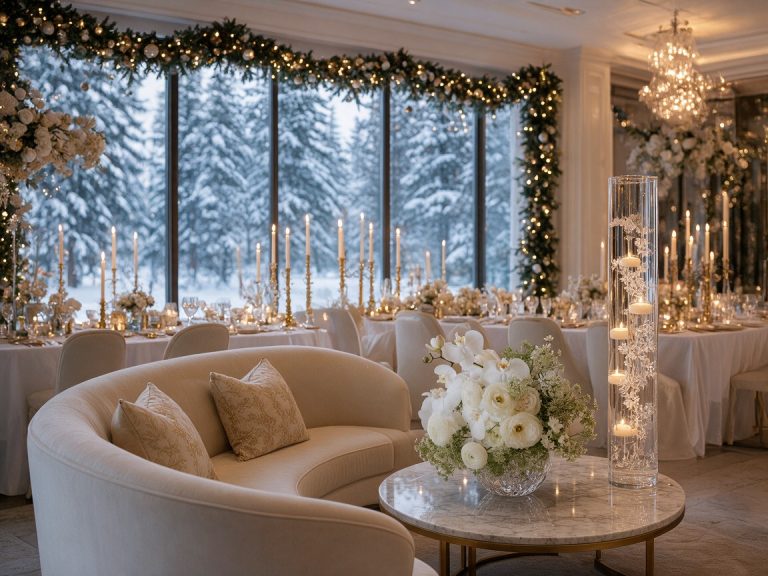
A woodland idea inside a historic stone room should probably lean into shadow, branches, dark flowers and textured paper rather than attempting to grow an actual forest indoors. A celestial concept in a glass room can use reflection and the changing natural light instead of projecting stars onto every available surface.
The venue is not a neutral container. Use its architecture, landscape, restrictions, light and routes as part of the translation.
A design that ignores the building always ends up needing more props, purely to make the theme legible against a room that is arguing with it.

One thing should lead
Pick a hero gesture that carries the concept at room scale: a long saturated table, a field of light, an unexpected entrance, a floral structure, a sculptural bar. Then let the smaller details support it rather than each trying to be its own themed moment.
When every surface is decorated literally, guests notice the quantity of references. When one strong gesture leads, they notice the atmosphere. Those are very different memories.
Repeat the relationship, not the icon
Coherence comes from cues that recur: a color, a curve, a texture, a material, a quality of light, a botanical line. The repetition does not have to be identical, and it is better when it is not.
Dark iridescent glass at the bar can rhyme with a jewel-toned floral moment at dinner. A vertical branch gesture at the entrance can return later as tall light and narrow type.
Variation is what keeps a room from feeling branded. The idea reads because the relationships repeat, not because the same little icon has been applied to everything that would hold still.
Some references are not a supply bin
Themes that draw on living cultures, religious traditions, historical periods or specific communities carry a research responsibility. Work out what is genuinely relevant, avoid collapsing distinct traditions into one look, and go to authoritative or community-informed sources where accuracy and respect actually matter.
If a concept only works by borrowing sacred, ceremonial or identity-specific objects as decorative shorthand, the stronger design is almost always to translate the broader material and atmospheric qualities instead.
The swap test
Take the event title away and look at what is left. If the same objects could be relabeled as a completely different theme without changing a thing, the concept is too generic.
Then take the literal props away. If the atmosphere goes with them, the design was leaning on symbols.
A strong concept survives both: specific enough to have a point of view, secure enough not to keep announcing where it came from.
Reference, translate, release
- Reference: keep a small number of literal cues where they add meaning.
- Translate: convert most of the theme into color, material, light, scale, line, sound, sequence and guest experience.
- Release: delete the motifs that only repeat the label.
Most themes die at the first step because nobody ever reaches the third. The deleting is the design.
A concept lets the event outgrow its title
The best themed events are neither embarrassed by the theme nor imprisoned by it. They take the useful emotional and visual material seriously and then build an atmosphere that could stand up on its own.
The result can still be playful, dramatic, strange, romantic or unmistakably referential. It just feels like an event with a point of view rather than a costume waiting for someone to walk into it.
Atmosphere OS · Theme Atelier
A palette is not yet a decision.
Atmosphere OS holds the color, the material, the light and the room in one object, so moving any of them shows you what it does to the rest. Costs come back as indicative bands and never as quotes, which is the difference between planning and pretending.
The rulebook is public. Every formula it runs on is written down where you can disagree with it.
Field notes and corrections
When a number here turns out to be wrong, you hear about it.
Three things arrive and nothing else. The new field note — bar rates, cover widths, service clearances, the arithmetic worked through on one real evening. A line when a new World or Mini Occasion opens, because a night only goes up once it can actually be thrown. And a correction whenever a rule in the published rulebook changes, or a number the tools rely on turns out to have been wrong. There is no weekly slot, because there is nothing weekly to put in it.
One email per field note or opening, plus corrections when a published figure moves. Unsubscribe from any of them.
Continue through the system
Pretty is still not a plan.
A party gets planned in roughly this order. Pick the chapter where your next problem lives.
What you have to decide next
One decision constrains the next. This is the order they actually happen in.
More in this chapter


See the complete five-chapter Event Design Intelligence map →
You must be logged in to post a comment.