Design Atelier
Design Note: Opalite Event Design Without the Iridescent Gift-Shop Effect
Opalite searches are up 2,710%. Once every surface goes pearlescent, the room stops shimmering and starts looking like a cosmetics display.
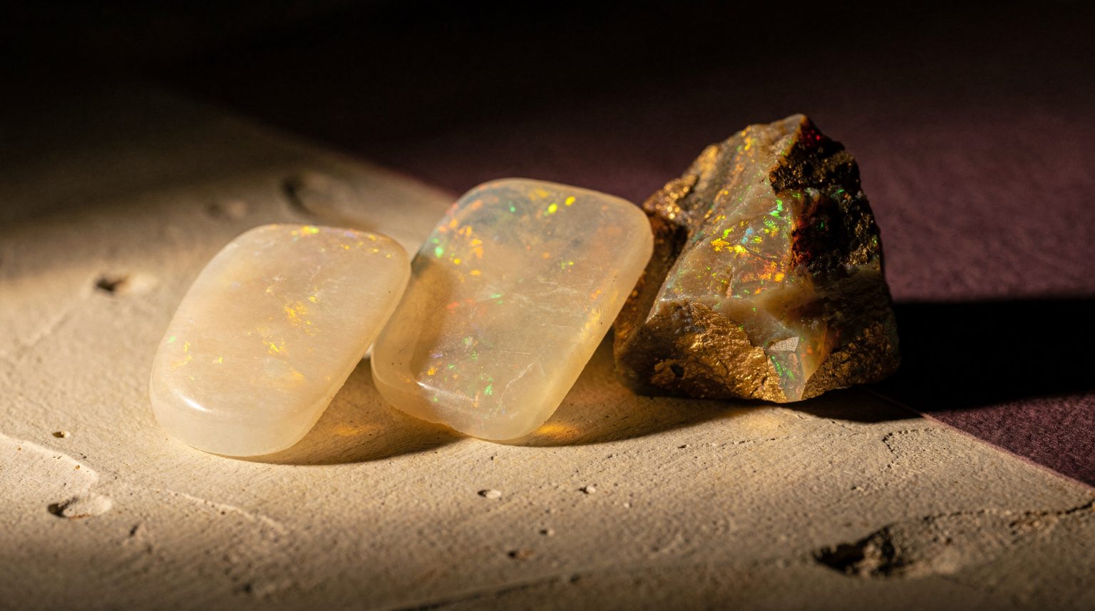
Generated image Made with flux-2-pro via ElevenLabs to show what this article describes. Nothing in it was photographed at an event.
Opalite is one of the sharpest current search signals in wedding design, Pinterest reports the opalite aesthetic up 2,710% in its 2026 wedding trends data. I understand the appeal instantly, it changes with light, shifts color as guests move.
The risk is just as obvious. Once every surface becomes pearlescent and reflective, the room stops shimmering and starts looking like a cosmetics display.
The useful version of opalite isn’t a color palette. It’s a light-and-material system, and treating it any other way is how you end up with a very expensive gift shop.
Start with one reflective family, not five
Pearlescent, mirrored, translucent, frosted, chrome, I choose the dominant behavior first. You can mix them, but one has to lead. When every finish competes equally, the room loses all hierarchy.
My formula, one luminous material, one matte grounding material, one dark quiet neutral. Opalescent acrylic against charcoal linen feels intentional. Opalescent acrylic against chrome linen and mirrored chargers feels like inventory.
Design for the light actually changing throughout the night
Iridescent materials are highly dependent on angle and source. I test samples in daylight and event light before approving anything. A panel that looks soft lavender at noon may read green or silver after sunset, and I’d rather find that out before the invoice. Materials this dependent on their source are a strong case for deciding the lighting first.
Protect legibility above all else
I never put essential wayfinding or table assignments on low-contrast iridescent surfaces unless the typography has real contrast in every lighting condition. Guests shouldn’t have to tilt a sign like a credit card hologram to find table eight. Everything a guest needs to find is orientation work before it is styling.
Let translucency create depth, not just decoration
Layering beats adding more objects, every time. A translucent panel in front of foliage or a frosted menu over colored paper creates depth without clutter. Clearances and exits stay fully intact, no exceptions.
Use chrome as punctuation, never as the whole sentence
Chrome sharpens the dreamy quality of opalescence when it’s concentrated, hardware, candle bases, one sculptural object. If every object is mirrored, guests become part of the centerpiece whether they agreed to it or not.
Keep the flowers and textiles quieter than usual
When surfaces already shift color, floral palettes benefit hugely from restraint. White, smoke, deep plum, that gives the shimmer somewhere to actually land. I don’t introduce six pastel flower colors just because they all appear somewhere in the iridescent reflection.
My own opalite test
Photograph the room from the entrance and from a seated guest position, under flash. If the material still creates depth and one focal point clearly leads, the system is working. If every surface is glowing equally, I edit before ordering another pearlescent object.
Trend signal: Pinterest’s Wedding Trends Report 2026 reports opalite aesthetic searches up 2,710%.
Atmosphere OS · Theme Atelier
Turn the mood into something a florist can quote.
Theme Atelier builds palette, materials, lighting and spatial mood into one system, then writes it in language a vendor can price. Every number it produces comes from a published rule, and the rulebook names the judgements it deliberately refuses to call rules.
The rulebook is public. Every formula it runs on is written down where you can disagree with it.
Continue through the system
Pretty is still not a plan.
This field note belongs to a larger event-design system. Follow the chapter that explains the next pressure point instead of falling back into an undifferentiated archive.
What you have to decide next
One decision constrains the next. This is the order they actually happen in.
- Venue Will this room hold it? When Prismm Goes Dark: The Deadline Is September, Not December
- Guest experience How will guests move through it? A Party Needs a Premise, Not a Costume
- Production How does it get built and run? Ask It Twice: Why the Same Evening Comes Back With Five Different Answers
- Vendors Who owns each handoff? The Generator Was Late. The Washrooms Were Waiting.
More in this chapter


See the complete five-chapter Event Design Intelligence map →