Design Atelier
Design Note: Plum and Olive Without the Muddy Event Palette
Plum and olive can become a brown-green fog remarkably fast. Treat the colors as roles, control undertones and test them under the event's actual light.
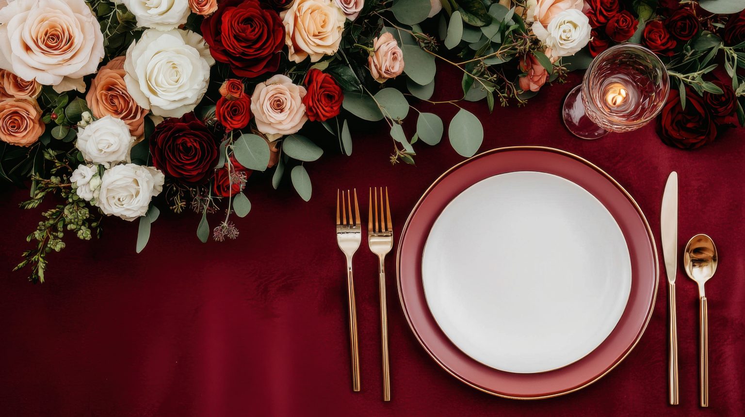
Plum and olive can feel botanical and grounded without leaning on beige-and-gold neutrality. They can also become a brown-green fog remarkably quickly if nobody is paying attention.
The palette works when plum and olive are treated as roles, not two swatches that have to appear on every single object.
Decide which color actually leads
Plum as the dominant emotional color with olive grounding it, or the reverse. A fifty-fifty split often feels indecisive. For evening events, plum can carry depth through linen, paper and upholstery while olive appears in foliage, glass or secondary surfaces. In daylight, the hierarchy may reverse. Color holds up better when it is planned as a sequence across the event rather than a set of matching swatches.
Control the undertones before anything else
Not all plums and olives cooperate. Blue-based plum with yellow olive can vibrate awkwardly; brown plum with khaki olive collapses straight into mud. Pull physical samples together under the venue’s real lighting and look for a shared undertone before approving rentals or print.
Add one pressure-release color
A lighter neutral—parchment, pale stone, soft silver, warm bone—keeps every surface from sitting in the same middle-dark value range. Black can work as structure, but use it carefully if the venue is already dark.
Use metals by temperature, deliberately
Antique brass warms the palette and can make it feel historic. Silver makes it cooler and more modern. Highly polished yellow gold can push the whole thing toward holiday decor if overused.
Let botanicals do the actual work
Olive does not have to mean literal olive branches; it can come from moss, foliage, stoneware or painted surfaces. Plum does not require purple roses; think berries, smoke bush, paper, textile and fruit.
Remember lighting changes the whole palette
Warm amber light pulls plum toward burgundy and olive toward brown. Cool light makes olive grayer and plum more violet. Test the full palette after dark if the event runs into evening. It is one more reason lighting gets decided before the palette is finished, not after the linen order.
The palette test
Squint at the room. You should still see a clear hierarchy of dark, mid and light values. If everything blends into one tasteful swamp, add contrast rather than more decor. A flat value range is one of the quieter reasons a perfectly pretty room still feels like nothing.
Signal note: plum-and-olive wedding searches spiked in 2026. The color intelligence is format-neutral; the same undertone, value and lighting problems appear at any event using the palette.
Atmosphere OS · Theme Atelier
Turn the mood into something a florist can quote.
Theme Atelier builds palette, materials, lighting and spatial mood into one system, then writes it in language a vendor can price. Every number it produces comes from a published rule, and the rulebook names the judgements it deliberately refuses to call rules.
Costs come back as indicative bands rather than quotes, and seasonal notes are filters rather than promises.
Continue through the system
Pretty is still not a plan.
This field note belongs to a larger event-design system. Follow the chapter that explains the next pressure point instead of falling back into an undifferentiated archive.
What you have to decide next
One decision constrains the next. This is the order they actually happen in.
- Venue Will this room hold it? When Prismm Goes Dark: The Deadline Is September, Not December
- Guest experience How will guests move through it? The Room Should Know What Kind of Night It Is
- Production How does it get built and run? Ask It Twice: Why the Same Evening Comes Back With Five Different Answers
- Vendors Who owns each handoff? The Generator Was Late. The Washrooms Were Waiting.
More in this chapter


See the complete five-chapter Event Design Intelligence map →