Design Atelier
Design Note: A Monet-Inspired Event Without Printing Water Lilies on Everything
Monet searches are up 320%. The obvious mistake is printing Water Lilies on the menus. The better move is borrowing how he actually handled light.
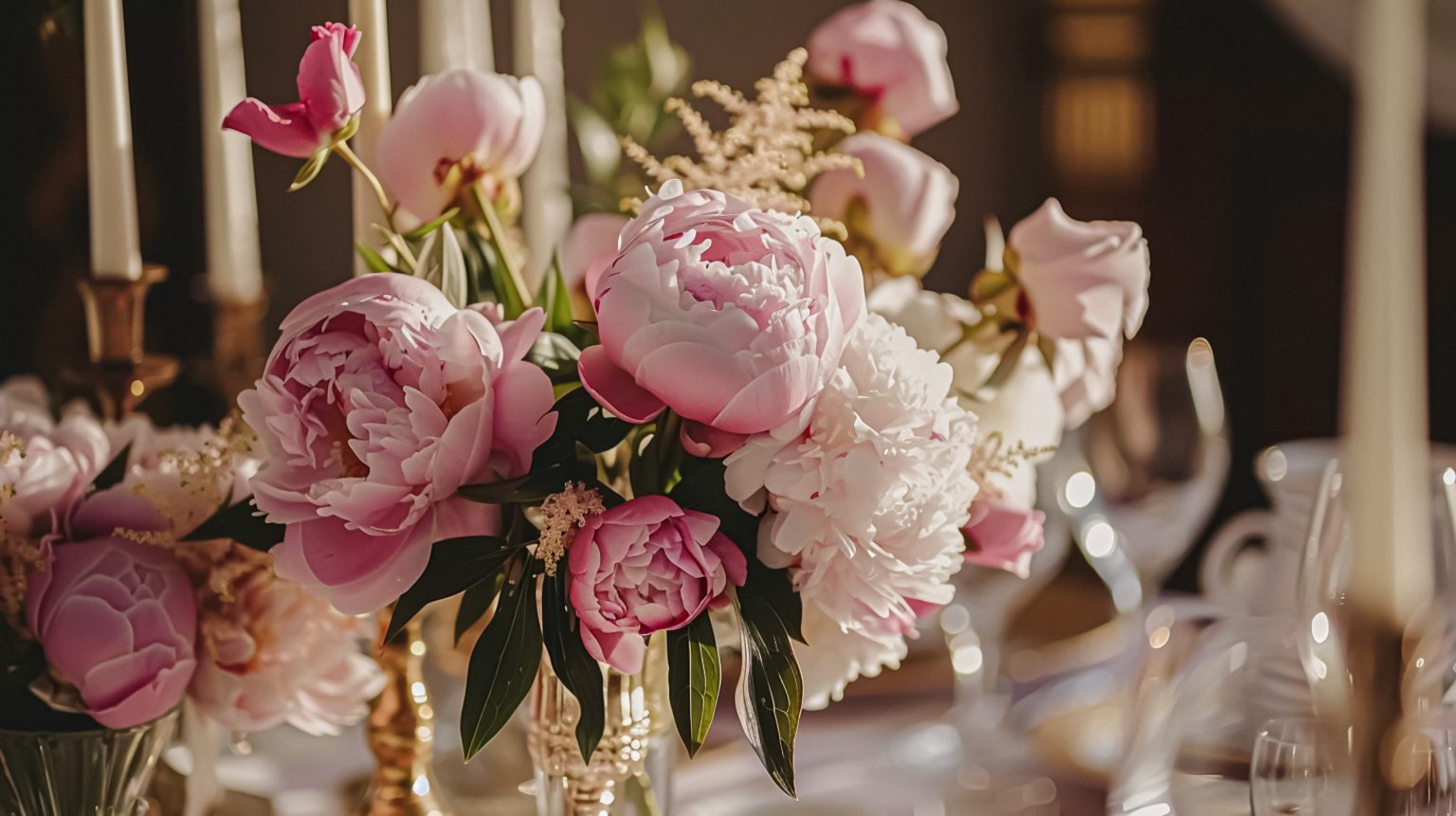
Monet wedding searches are up 320% in Pinterest’s 2026 trend report. Makes sense to me, impressionism offers exactly what event design wants right now, atmosphere over literal theme, color that shifts with the light.
The obvious mistake is printing Water Lilies on menus and calling it a day. The better approach borrows the actual logic Monet was working with.
Start with changing light, the way he did
Monet studied how the same subject shifted under different light. I plan the event’s palette by time of day, cooler at arrival, warmer at dinner, deeper mauve as evening settles. Let the lighting transform the room instead of locking it into one static color. That only works if the light is decided first and everything else is chosen to sit inside it.
Build color from neighbors, not exact matches
Impressionist color works because adjacent tones vibrate against each other, lavender beside green, peach beside blue-gray. I never buy every object in one exact Monet blue. I use families of related color and let them vary. Colour behaves better when it is treated as a sequence through the evening rather than a matching exercise.
Keep the floral work loose at the edge, disciplined in the mass
Cosmos, sweet peas, delphinium, garden roses, movement and varied petal structure. I build broad color fields rather than tiny mixed bouquets. The goal was never a botanical inventory. It’s an impression of color accumulating.
Use reflective surfaces sparingly, not everywhere
Water is central to the visual language, but a literal pond isn’t required. Smoked mirrors, polished trays, glossy ceramic, one or two reflective moments. More than that turns the event into a showroom.
Let fabric blur the hard edges
Sheer drape, washed linen, soft silk. I skip direct reproductions of actual paintings entirely. Abstract color fields read as far more elegant than famous artwork turned into wallpaper.
Design the tablescape like it’s a real foreground
I keep some objects crisp, plates, glassware, flatware, while letting the florals and candles soften around them. If everything is blurred and pale, the table loses its structure entirely.
Choose the garden idea that actually fits the venue
A conservatory or courtyard reinforces the concept naturally, but indoor spaces work just as well when light and material are handled deliberately. I don’t import enough faux greenery to simulate Giverny inside a ballroom. The point was atmosphere, not reconstruction.
Use stationery as a quiet color study of its own
Translucent paper, soft washes, fine linework, kept genuinely readable. Watercolor doesn’t excuse low contrast or illegible pale text.
Avoid the museum-shop literalism entirely
No mandatory parasols, no water-lily place cards unless they solve a real visual problem, no miniature easels holding table numbers because painting. The event should feel influenced by a way of seeing, not licensed by a gift shop. It is the old difference between a concept and a theme you have to wear.
My own Monet test
If the room’s strongest effects are light, shifting color, and soft edges, the concept is working. If guests can identify the exact painting you copied from thirty feet away, you’ve designed merchandise instead of atmosphere.
Trend signal: Pinterest’s Wedding Trends Report 2026 reported Monet-wedding searches up 320%.
Atmosphere OS · Theme Atelier
A palette is not yet a decision.
Atmosphere OS holds the colour, the material, the light and the room in one object, so moving any of them shows you what it does to the rest. Costs come back as indicative bands and never as quotes, which is the difference between planning and pretending.
Free to use, local-first in your browser, and there is no account until you ask for one.
Continue through the system
Pretty is still not a plan.
This field note belongs to a larger event-design system. Follow the chapter that explains the next pressure point instead of falling back into an undifferentiated archive.
What you have to decide next
One decision constrains the next. This is the order they actually happen in.
- Venue Will this room hold it? When Prismm Goes Dark: The Deadline Is September, Not December
- Guest experience How will guests move through it? Why the Cake Still Matters
- Production How does it get built and run? Ask It Twice: Why the Same Evening Comes Back With Five Different Answers
- Vendors Who owns each handoff? The Generator Was Late. The Washrooms Were Waiting.
More in this chapter


See the complete five-chapter Event Design Intelligence map →